K-means clustering
In this post I shall show how to cluster geographic data using K-means. First we must import some libraries and get the dataset. For now I'm not really going to worry about using anything other than the Lat/Long values, in later post I'll get to more complex analysis.
import numpy as np
import matplotlib.pyplot as plt
import pandas as pd
from sklearn.cluster import KMeans
import requests
import geopandas as gp
from shapely.geometry import Point
I'll be using this L.A. Crime dataset.
r=requests.get('https://data.lacity.org/resource/7fvc-faax.geojson')
data=r.json()

features=data['features']
This particular dataset requires a little bit of cleaning before going any further. It happens that some of the coordinates are assigned to 0,0. In this case I'm merely using the dataset as an example for clustering, so I'm going to remove the points. In other instances, it may be better to use a different method.
obj=[]
for i in features:
    corr=i['geometry']['coordinates']
    lon=corr[0]
    lat=corr[1]
    if lat!=0 or lon!=0:
        obj.append((lon,lat))
    else:
        pass
obj

df=pd.DataFrame(obj, columns=['lon','lat'])
geometry = [Point(xy) for xy in zip(df.lon, df.lat)]
crs = {'init': 'epsg:4326'}
gdf = gp.GeoDataFrame(df,crs=crs, geometry=geometry)
Next I'm going to project the data into NAD83 / California zone 5
gdf = gdf.to_crs({'init': 'epsg:26945'})
As always before going forward I should plot my data, to insure things are okay. Try to imagine how you would like to divide out the clusters so you can compare your ideas with K-means.
f, ax = plt.subplots(1, figsize=(20, 15))
ax.set_title("LA Crime", fontsize=40)
ax.set_axis_off()
#LA.plot(ax=ax,  edgecolor='grey')
gdf.plot(ax=ax, color='black')
plt.show()

Everything looks good, now let's do some clustering. We'll need to extract the xy values from the geometry field and contruct a numpy array.
a=pd.Series(gdf['geometry'].apply(lambda p: p.x))
b=pd.Series(gdf['geometry'].apply(lambda p: p.y))
X=np.column_stack((a,b))
Next I'm going to use the elbow method to determine the optimal number of clusters. At some point increasing the number of clusters will only result in marginal gains or the loss of insight. If we selected for the lowest possible variance, then each point would have its own cluster. We're going to look for here is the location of the graph with the greatest change in the within cluster sum of squares (it should look like an elbow).
wcss = []
for i in range(1, 14):
    kmeans = KMeans(n_clusters = i, init = 'k-means++', random_state = 42)
    kmeans.fit(X)
    wcss.append(kmeans.inertia_)
plt.plot(range(1, 14), wcss)
plt.title('The Elbow Method')
plt.xlabel('Number of clusters')
plt.ylabel('WCSS')
plt.show()

It would appear the optimal number of clusters is 4, so that's what we'll go with. This is only a suggestion, depending upon the problem it may be logical not to heed the elbow method's guidelines, for example if we were trying to use it as a classifier on 3 known categories while the elbow method suggests 2.
kmeans = KMeans(n_clusters = 4, init = 'k-means++', random_state = 5,  max_iter=400)
y_kmeans = kmeans.fit_predict(X)
k=pd.DataFrame(y_kmeans, columns=['cluster'])
gdf=gdf.join(k)
Our data has been clustered and joined back to the GeoDataFrame. Now we're ready to plot the results.
f, ax = plt.subplots(1, figsize=(20, 15))
ax.set_title("LA Crime", fontsize=40)
ax.set_axis_off()
gdf.plot(column='cluster',cmap='Set2', ax=ax, markersize=80)
plt.show()

Do you agree with the results? Are they what you expected? Perhaps we should try increasing the mumber of clusters to see what happens.
kmeans = KMeans(n_clusters = 5, init = 'k-means++', random_state = 5,  max_iter=400)
y_kmeans = kmeans.fit_predict(X)
k5=pd.DataFrame(y_kmeans, columns=['cluster5'])
gdf=gdf.join(k5)

f, ax = plt.subplots(1, figsize=(20, 15))
ax.set_title("LA Crime", fontsize=40)
ax.set_axis_off()
gdf.plot(column='cluster5',cmap='Set2', ax=ax, markersize=80)
plt.show()

What do you think- Is K-means the tool for the job? What is the optimal number of clusters? There's not a simple answer. Problems are often domain specific, perhaps crime data would benefit from having a high number of clusters or maybe clustering simply isn't a useful insight. K-means tends to favor "round" clusters, perhaps that's why the middle section is being dividing in half rather than producing a large oval cluster. In a later post I'll be revisiting this dataset for further analysis to see what additional insights can be gain by using different algorithms and increasing the dimensionality. I'll leave you with a famous quote about statistics.
"Essentially, all models are wrong, but some are useful"- George Box
Computational Geometry Part I: Convex Hull
Computational geometry is the study of algorithms which relate to geometry and often serves as the bedrock for many GIS functionalities. On the surface a problems in CG can look quite simple, yet when trying to write code for it can quickly a daunting yet fun challenge. Thankfully many problems in GC have been solved and there are mature libraries full of solutions, CGAL is probably the most promonent. There are Python bindings to it and it is used in applications like QGIS. That being said, being able to solve problems in CG isn't needed to be able to understand and use the existing concepts and solutions.
Common problems in CG can appear as such: Which points are in which polygons? To the human eye such a quesition would seem trivial, yet coding it may not come as intutively. For this intro I'm going to focus on one of the most fundamental concepts in CG- the convex hull. Imagine you had some nails on a board and tied a rubber band around them, that would produce the shape of a convex hull. It is the minimum bounding area for a set of spatial features (points, polygon or line) and it must be convex.
from shapely.geometry import MultiPoint
mp=MultiPoint([(-30, 100), (30, -20), (-30, 2),(-52, 42), (-53,12), (71,-25), (-11, 50) ,(-31, 40)])
mp
mp.convex_hull
Any general purpose GIS software (ArcMap, QGIS...) should have support for producing convex hulls. Reasons for using this functionality include converting points to polygons and creating simpler shapes to increase processing speeds. I hope this information is useful, as I plan to continue adding small posts about various algorithms in machine learning and computational geometry.
Geocoding with the Google Maps API
import requests
import folium
You're going to have to get an API key if you don't aready have one by going to the Google Geocoder API. After that we need to contruct our URL to send the request.
The first part of the URL will appear as such, go ahead try clicking on it and see what happens.
https://maps.googleapis.com/maps/api/geocode/json?address=time+square+new+york+city&key
When making a request you should have an API key, but be careful not to make too many requests, you might hit a query limit.
api_key= # Place key here

url="https://maps.googleapis.com/maps/api/geocode/json?address=time+square+new+york+city&key="

r = requests.get(url+api_key)
Now that we have the response object r we should check the status code. It looks like we have a 200, which is good. For more information on status code you can refer to status codes.
r.status_code
Now we're going to use Requests built in JSON decoder.
rjson=r.json()
rjson
Now all we need to do is access the information we want from the JSON and do something with it. In this case I'm going to make a simple map with a marker for Time Square.
lat = rjson['results'][0]['geometry']['location']['lat']
lng = rjson['results'][0]['geometry']['location']['lng']
address = rjson['results'][0]['formatted_address']
map_1 = folium.Map(location=[lat, lng],
                   zoom_start=14,
                   tiles='Stamen Toner')

folium.Marker([lat, lng], popup=address).add_to(map_1)

map_1
Well that's all folks! Geocoding can be pretty easy, but when dealing with large batches of data and funky addresses, it can quickly become a headache. For more information on usage limits go to Usage Limits. Always make sure to validate the data or at least be aware that it may not aways be accurate.
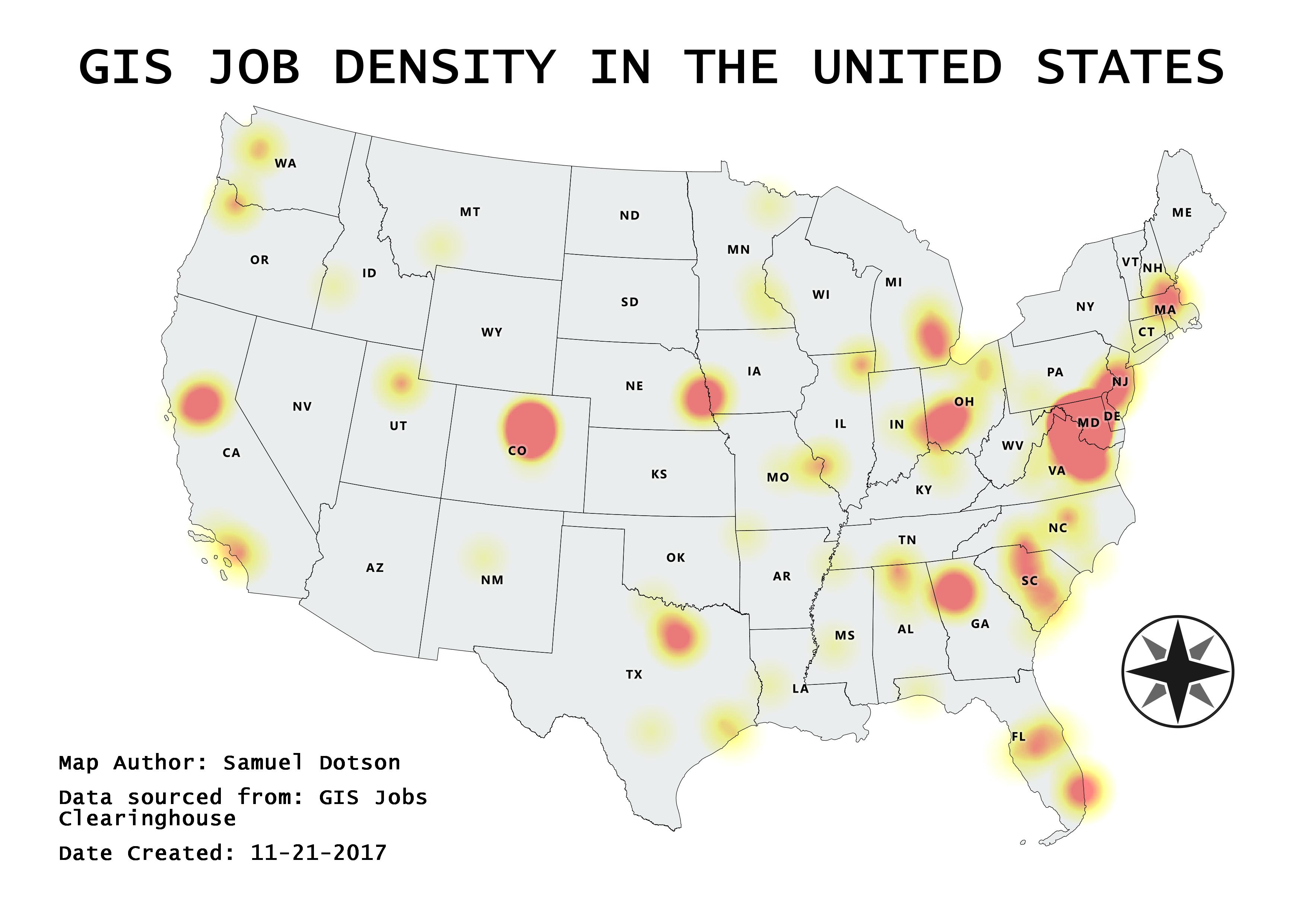
Where are all the GIS jobs?
So you want to know where the GIS jobs are, well here's a map for you. I collected the data from GIS jobs Clearinghouse and proformed a simple heatmap using QGIS.
The Ghost Map
Some would argue Geospatial analysis didn't come into being until computers were available, I would argue otherwise. Note I'm not using the term GIS in this context, because it's too broad and ambiguous. John Snow is credited as the father of modern Epidemiology (not the Game of Thrones character), though arguably he is also the grandfather of geospatial analysis. In 1854 John Snow was investigating a cholera outbreak in Soho, London. To do this he plotted death locations on a map and discovered a trend, everything was near the broad street pump. At the time the widely help belief was the disease was transmitted via "foul air", John disagreed and thought it was due to contaminated water and his map helped him prove it. Today we still have John's original map and data; so why not replicate his study using more modern tools.
Here's Dr. Snow's original map, if you'd like to read more into his work go checkout this wikipedia article

All my work was done using QGIS. In this first map I generated Voronoi Polygons using the pump locations. For each polygon the pump will be the centroid and all the space inside will be closed to that particular pump. Next I did a point in polygon analysis to get the death counts for each polygon.

This is just a basic heat map, it's clear to see that the majority of the fatalities are around the broad street pump. Well the evidence appears to be rather incriminating, I think it's safe to remove the Broad Street pump's handle now.

Making a map with Python
Making maps with Python
import os
import numpy as np
import matplotlib
import matplotlib.pyplot as plt
import pandas as pd
import geopandas as gp
import pyproj
Method 1: Folium (based upon Leaflet.js)
import folium
m=folium.Map(
    location=[36.5236, -87.6750],
    tiles='Stamen Toner',
    zoom_start=4
)
m
Now let's change the basemap and add some vector layers
m=folium.Map(
    location=[36.5236, -87.6750],
    tiles='Mapbox Bright',
    zoom_start=4
)
folium.Marker([45.3288, -100.6625], popup='<i>I"m a marker!</i>').add_to(m)
folium.CircleMarker(
    location=[37.5215, -112.6261],
    radius=50,
    popup='I"m a circle',
    color='#3186cc',
    fill=True,
    fill_color='#3186cc'
).add_to(m)
m
Using Geopandas
While Folium looks nice, I tend to prefer using Geopandas. Being built upon Pandas means it's lighting fast and the syntax is similar to Pandas. So you can easily manipulate fields and process data quickly.
import matplotlib.pyplot as plt
import pandas as pd
import geopandas as gp
usa=gp.read_file('united-states/us-albers-counties.json')
plt.style.use('fivethirtyeight')
It's really easy to plot data using Geopandas.
usa.plot()

Okay so we may need to clean this up some. Like doing away with the pesky axis, enlarging the map and creating a choropleth map.
f, ax = plt.subplots(1, figsize=(15, 10))
ax.set_title("US counties")
ax.set_axis_off()
plt.axis('equal');
usa.plot(ax=ax)
plt.show()

Before proceeding let's take a quick look at our data.
usa.head()
unemployment=pd.read_csv('unemployment.csv')
unemployment.head()
Now I'm going to merge our two datasets together to create a choropleth map.
usa['FIPStxt']=pd.to_numeric(usa['fips'].str[1:])
#=pd.merge(unemployment, usa, how='right', on='FIPStxt')
US_jobs = usa.merge(unemployment, on='FIPStxt')
Let's go ahead and plot everything to make sure the merge was successful.
f, ax = plt.subplots(1, figsize=(15, 10))
ax.set_title("US unemployment rate 2016 by counties" , fontsize=17)
ax.set_axis_off()
plt.axis('equal')
US_jobs.plot( column='Unemployment_rate_2016' ,cmap='OrRd', ax=ax,  edgecolor='grey')
plt.show()

So it turns out that not everything made it through the merge. So let's pick a state that made it through the merge, focus on that and do some number crunching. I'm going to go with California.
CA_jobs=US_jobs.loc[US_jobs['iso_3166_2'] == 'CA']
f, ax = plt.subplots(1, figsize=(15, 10))
ax.set_title("California unemployment rate 2016 by counties", fontsize=17)
ax.set_axis_off()
plt.axis('equal')
CA_jobs.plot( column='Unemployment_rate_2016' ,cmap='OrRd', ax=ax,  edgecolor='grey')
plt.show()

Great! Let's dig a little further and do some graphing with Matplotlib. First I'm going to list all the columns so we know which column headers to pick.
list(CA_jobs.columns.values)
Now I'm going to make a time series plot for all unemployment rates from 2007 to 2016 for all the California counties. Given that there are 58 of them I'll forgo adding county labels.
f, ax = plt.subplots(1, figsize=(20, 25))
ax.set_title("California unemployment time series by counties", fontsize=20)
CA_jobs2 = CA_jobs.filter(regex='Unemployment_rate')
plt.plot(pd.Series(list(range(2007,2017))), CA_jobs2.T)
plt.show()

Well, this is for now the end of my first blog post. I might come back add some more map making methods later on, but for now the plan is to keep updating things and add more posts. I hope the material here has been informative. Please feel free to contact me about any potential improvements. Thank you free reading my blog, now go make some awesome maps!